A quick note: Some people debate the choice of manufacturers and if the brand matters. Basically, it doesn’t. The examples in this article are shot using Canon cameras and lenses, though I believe that the results would be near identical using any major brand of camera gear. The big picture truth is that the differences between brands are minute in terms of the end results and each company is constantly striving to be competitive with the latest offerings. Once upon a time the differences might have been more dramatic, but digital photo technology has advanced to the point that any new camera should be able to provide satisfactory results if used properly. I’m a Canon user because that is the system which I chose to invest in and I am very happy having made that choice, though I fully support comparing options and getting whatever suits both your needs and your budget.
There are plenty of tutorials on photographing artwork available and I encourage you to read through those as well, because I don’t believe any one method to be the one true way. That said, I’ve read a number of those other tutorials and felt that it might be helpful to some people to share my own method which I’ve developed over the past ten years. I’ve gone through many different processes, set-ups, and cameras and shot several hundred paintings over that time and have come to adopt a work-flow which is fast, simple, and potentially very budget conscious. The goal here is to demonstrate how to achieve clear, accurate photos of your artwork for the purpose of reproduction in a streamlined fashion. This may look like an impenetrable wall of information, but it is really very simple and fast to implement once you get a handle on it. Using this method, I generally get great results on the first shot with a total time of less than a minute to set up and shoot, and then another minute of digital processing. I also want to demonstrate that, though I recommend using the best equipment available to you, professional print quality results are completely possible on a shoestring budget.
Tools Required:
To begin, there are a few basic tools which are absolutely essential.
A Camera.
Choosing a camera is itself quite a broad topic because there are so many options to get confused by. If you are working on a tight budget ($100-$500), you’ll likely be looking at point and shoot or pocket sized cameras. If you want something more advanced, you’ll be looking at DSLR (entry level kits start around $500). *edit* and Mirrorless, added below...
Point and shoot:
When shopping for a point and shoot to photograph paintings with, there are a few key features to look for. The first and most important is to find a model which will allow you
as much manual control as possible. Many point and shoots only have auto and semi-auto shooting modes and this can be limiting for shooting artwork. A camera which lacks manual controls also almost certainly does not allow you to record files in
RAW format, another concern for getting high quality reproductions (particularly if you need to print your images large). The third concern is to find a camera which has
at least a 10-12 megapixel sensor. Megapixels are counted by multiplying the number of pixels across an image by how many pixels tall it is and then dividing by one million. A ten megapixel image is literally made up of roughly ten million pixels. The more pixels, the higher the resolution (and therefore print size) of the images it records. If your camera records in RAW, there are also ways in post processing to increase final resolution significantly, though it is always best to start with the most pixels possible. Because megapixels are really just a measure of area using pixels (like measuring space using square feet), the benefits become less dramatic as the number increases. 10 mega pixels is enough to get a print quality image with at magazine size. The logic dictates that more is better, though I have read that cramming too many pixels into too small of a sensor (as is found in this class of camera) can give poor results so don't get too caught up in megapixel fever.
Here are some current point and shoot models which shoot in RAW mode, allow a great deal of manual control, and have decent resolution:
Nikon Coolpix P7700
Panasonic Lumix LX-7
Canon Powershot G-15
Canon Powershot SX50 HS
Canon Powershot S110
Fujifilm Finepix HS30 EXR
Olympus XZ-10
I believe these generally retail between $300-$500 new, though you could likely find used or earlier models for less. If buying earlier models, just be sure to double check their specs. My point and shoot samples in this article is a Canon Powershot S90, which is a predecessor to the S110 and currently sells used on Ebay and Amazon for about $200.
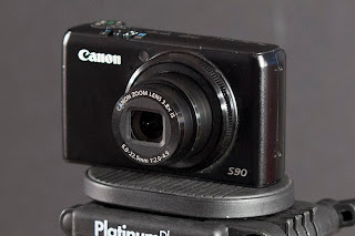 |
| Canon Powershot s90, available used for about $200. |
*edit*
Mirrorless:
I realize that I made a major omission by not mentioning
Mirrorless, which is a relatively new alternative to DSLR that is
typically smaller and more affordable but competitive in quality. Some
are comparable in size and price to point-and-shoots but additionally
allow the use of multiple lenses and tend to be much more likely to give
manual control and RAW. Most importantly, they tend
to have significantly larger and more capable sensors for capturing the image. This
is a system worth looking into, especially for the budget conscious.
Nikon, Olympus, and Panasonic all offer body and lens kits for as low as
$300 brand new as of this writing and quality reports have largely been
impressive. For a little bit more ($500+) you can get kits which rival DSLR in image quality and features, and some which even share identical innards in a more compact frame. I left the point and shoot segment above in the interest of providing more info and options, though as these two types of camera are on overlapping pricepoints, I'd say buy a mirrorless instead.
DSLR:
DSLR, or Digital Single Lens Reflex, is the option for those looking for higher quality and control. One of the most obvious differences between pocket cameras and DSLR is that, due to the larger sensor size, DSLR potentially delivers significantly higher resolution. I recommend going the DSLR route if you have the budget. Even the most basic entry model DSLR should cover all of the features mentioned above, though you should always double check to be sure (particularly if buying older model used equipment). That being the case, I won’t go into the details of crop vs. full sensor or any of that being as it won’t make much difference to shooting artwork. While the differences between entry level and professional level DSLRs can be quite pronounced, any of them used properly will do just fine for reproducing art. I do advise investing in a good lens though. For general photography you’ll likely want something in the standard zoom range (24-70), though I like shooting telephoto for paintings. My go-to lens for shooting art these days is a high end 70-200 and I typically shoot in the middle of that where distortion is lowest and image quality is sharpest. More on this in a bit.
*edit* I've been asked about macro lenses. One of the primary features of a macro lens is the ability to focus extremely close to your subject which is not really relevant unless you happen to work at miniature scale. What is a relevant feature, however, is that macro lenses also tend to have higher image quality and rendering. Theoretically, they will deliver a higher standard of image quality, though there are really good non-macros out there which could give near identical results.
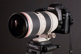 |
Canon 5Dmk2 with an EF 70-200 f2.8 IS2 attached. My weapon of choice for shooting artwork. Buying the non-IS version of this lens will cut the price of the lens in half and still deliver the same results for tripod mounted shooting.
*edit* I've since switched to using a Zeiss 100mm f2 macro lens. In a blind taste test it would be six of one and half a dozen of another on the final processed image and, for its "limitations" (no af, no zoom range) the Zeiss would not sway an average buyer even at one stop faster, considerably smaller, and less expensive. That said, it is the highest definition and least distortion lens which I've ever used, focuses close, and is really pretty to look at. All that said, I'm sure you could get super results with the Canon brand 100mm macro at half the price of the Zeiss. At a certain level, the differences get very subtle. |
Tripod.
For my method of shooting artwork, a tripod is essential. It doesn’t have to be anything fancy, but I recommend something reasonably stable. My $50 Sunpak 7500 served me well for years. Of course there are cheaper choices as well as much much more expensive ones, but the important thing is something which isn‘t going to wobble.
Lights.
This is always the sticky issue for artwork. I used to work with expensive and bulky photo strobes, but they are really a pain to deal with if you don’t have a dedicated photo studio. Some people also recommend the outdoor method shooting in shade or on an overcast day, though I find that to be even more inconvenient (especially considering how often I’m shooting a painting late at night to make a deadline). In the end, I’ve found I get fantastic results using a couple cheap tree style floor lamps from target (each fitted with three 100w natural spectrum bulbs). As a bonus, they also do a nice job keeping my studio well lit. An alternative to those could be $12 clamp lights from the hardware store fitted with as bright of natural spectrum bulbs as the will safely accept. I highly recommend natural spectrum bulbs over regular incandescents. I think the brand I buy is Reveal.
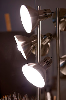 |
| $20 from your local Target |
Software.
You will also need photo editing software and ideally a RAW conversion program. I use
Adobe Photoshop and
Adobe Lightroom and get both (along with everything else that Adobe makes) for $50/month through the creative cloud subscription service. I think individually they are $20/month each. Photoshop will do basic RAW conversion without light room, but the options are so limited that it almost isn’t even worth it. Lightroom is not a must-have, but I recommend giving the free trial a spin and deciding for yourself.
WHY SHOOT RAW?
For those unfamiliar with the RAW format, this is a file type which some cameras offer that saves all data pertaining to an image without any compression added. If you are not shooting in RAW, your camera is disposing of data and compressing the image into a jpeg file when it writes the file to the camera card. This can limit your options in later editing. Among other things, RAW gives you extremely accurate color as well as the ability to correct a poor exposure. Perhaps most impressively, RAW also allows you to cleanly upscale images far larger than possible with a jpeg. I’ve increased RAW files from 18 inches tall to 56 inches tall and still had solid sharpness and image quality. Try that with a jpeg and see what happens.
The Three Elements of Exposure:
Before getting into camera settings and lighting set-up, I want to give a brief explanation of the three key components which will affect your exposure. These are
ISO, Aperture, and
Shutter Speed. For this tutorial, two of these are very important and one is not important at all, but all three should be understood.
ISO.
In the days of film, ISO was the “speed” of the film that you put in your camera. The higher the ISO number was, the more sensitive to light and the coarser the film grain. An ISO of 100 was recommended for bright sunny days and an ISO of 400 or 800 was better for dimmer indoor shooting. As the number increased, the image quality decreased. The same is true in digital photography. Every digital camera has a range of ISO settings which can be adjusted for different lighting situations. Modern DSLRs tend to give relatively clean results for high-ISO shooting, but the ideal is generally 100 (with the exception being Nikon, which I understand is 200) if you want the absolute sharpest clearest image possible.
*EDIT* I've since learned that my specific Canon model (the 5Dmk2) has ISO optimized the 160, not 100. The difference is slight but visibly cleaner in dark areas. If you're looking to squeeze every ounce of quality from your images, shoot some test shots and compare results. Also, my personal tests differed slightly from the official Canon charts (they indicated ISO 640 would be best but it isn't, at least not for me) so it always pays to check with your own eyes.
Aperture.
The aperture, or f-Stop, is the adjustable opening inside the lens which regulates how much light passes through to the shutter. As you change the f-stop, the opening gets larger or smaller. Some lenses are capable of allowing in significantly more light than others, thus allowing for faster exposures. This is what people are referring to when they talk about a lens being “fast” or “slow.” The lower the f-stop number, the more light is being allowed to pass through. Typically, shooting with the aperture fully open will give a softer image and possibly darker corners (vignetting) so it is not the ideal setting for reproducing artwork. Likewise, shooting with a very tiny aperture will cause diffraction which will also result in a soft image (similar to the effect of squinting your eyes). Though it varies from lens to lens, all have an ideal setting for optimal sharpness. With DSLR, that setting is commonly between f8 and f11, but may be lower for faster lenses (I shoot f5.6 on an f2 lens). Point and shoots tend to have much more variety to the aperture ranges which they allow so it is hard to give a standard go-to, but your safest bet is to avoid the extremes. Zooming may also limit the range available. It never hurts to shoot controlled tests at each f-stop to determine the optimal sharpness for any piece of equipment.
Shutter Speed.
The amount of time which the shutter is open when taking a photo is, you guessed it, shutter speed. Typically shutter speed is tremendously important if you are either shooting hand-held and/or shooting pictures of moving subjects. Since we are doing neither of these things, shutter speed is not a major concern using this method. In fact, we will use that to our advantage by sacrificing fast shutter speeds to allow for ideal ISO and Aperture settings.
Your camera settings:
Av Mode (aperture priority)
ISO 100 or 200 with Nikon
Aperture: f8 (DSLR) or middle of the range (point and shoot)
Shutter Speed: the camera will decide when shooting in Av Mode
File Format: RAW
Self-timer: on
Lighting and Artwork Position.
You should have your lighting set up so that it falls evenly across the surface of your artwork with an equal amount of light coming from both sides. If your room has an overhead light source, you probably want to turn it off. Position your artwork on its easel so that it is somewhat low to the floor and as close to vertical as you feel safe with and position the lamps to either side so that the light rakes across at about a 20 degree angle. You don’t want to have the angle too shallow as this will accentuate any surface texture and inconsistencies, though if you have it too deep it will bounce light into the camera and cause glare. When at an appropriately shallow angle, the light will bounce across usually without causing glare. You want, if possible, to have the artwork facing a dark wall. Anything bright in the room, such as white walls, floor, ceiling, or your t-shirt, may reflect in the surface of your artwork, especially if the image is dark and/or shiny. If need be, you might even buy a black sheet to hold up behind the camera to reduce room reflections (I do this often on problematic paintings.) To aid in color-correction, you may also want to place a white sheet of paper (or more sophisticated color correction materials) above or next to your artwork so that it is receiving the same amount of light. Additionally, I like to shoot paintings while still wet or with a coat of retouch varnish to bring out the richness of the color and contrast, though this may make the image more reflective and problematic if it is large and/or dark.
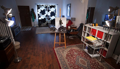 |
The spacial distortion of this photo give the illusion that the lamps are at a steeper angle than recommended, but you get the general idea. You'll have to fuss things around awhile until you figure out what works best in your space. That said, it's really this simple. For those with a keen eye, you'll notice that I also had the additional challenge of that large mirror on the right hand side throwing off my lighting balance, which is why the whole setup is tilted slightly to the left to eliminate any mirror reflected light from my painting surface.
*edit* it has been noted that I am pointed towards a window. Yes, this is generally a bad idea, though I so rarely shoot paintings while the sun is up that I did not even think about it. If needed, I'll simply angle myself so that it is not in the camera's frame. The curtains do a fine job of thwarting any lens flare. |
Camera Position.
Mount your camera to your tripod and set it a comfortable distance from your artwork. There is a balance to reach here and it will be different with different cameras, lenses, and surfaces. The further back you are, the less textural glare will reach you. On the other hand, the image should almost fill the frame without resorting to any digital zooming (optical zooming is fine). Point and shoot cameras often have digital zoom features in addition to the optical zoom, but they will degrade the image quality. If you can’t tell whether your zoom is optical or digital, the zoom always starts in optical and will finish the last leg digitally. You may feel the motor stop when it switches and it will likely indicate on the status screen that it is magnifying beyond the optical zoom range. You will likely also notice the image become grainier. Some cameras will allow you to disable the digital zoom which I would recommend doing.
If using a camera or lens with some type of anti-shake or image stabilizing feature, be sure to turn this feature off. When mounted on a stable tripod, the anti-shake actually creates feedback which will result in a soft image. Some cameras and lenses are designed to correct this automatically, but many do not.
Using the view screen (and the grid overlay if available), set your tripod height and angle to be as square as possible with your artwork. You want for your camera to be parallel and centered with the surface of your artwork. Another reason that I like shooting with a telephoto is that it tends to give far less distortion than wider lenses, though this can be easily corrected later in the RAW conversion. Squaring up the image with the camera is possibly the trickiest part of this whole process.
Once you have the artwork (and white balance aid if using one) correctly in your frame, focus and shoot. Sometimes I manually focus, but usually the auto focus is dead on. When you shoot, set the self timer so that there is a delay between pressing the shutter and capturing the photo. This will prevent your pressing the shutter from adding any shake to the camera. As mentioned above in the camera settings, we are shooting in Av mode, which means that the camera will automatically assign the shutter speed based on your aperture and how much light the camera is reading. This might result in some very long exposures (for me sometimes as much as 10 seconds) during which, obviously, you don’t want to touch or disturb anything. If the image looks too bright or dark, you can fine-tune it in the RAW conversion or (preferably) you can set the exposure level on the camera. I typically shoot paintings at a -1/3 exposure.
Processing.
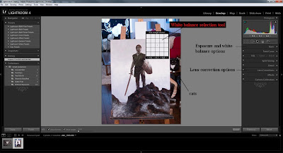
If shooting RAW, the next step will be to convert the image into a .tif file so that you can work with it in Photoshop. I do this using Adobe Lightroom. In the process of converting, I also automatically do three things on every image. The first is to correct my color. To do this, I simply select the White balance tool and click the eyedropper on my white card. Lightroom will auto adjust temperature and tint and, though occasionally I might tweak it further, it usually dose a very good job. The next thing I do is correct lens distortion, which is done by clicking “Enable Profile Corrections” under the “Lens Correction” menu. Lightroom reads what lens/camera you were using and applies the appropriate template to counteract distortion and vignetting. The final item on my checklist is to upscale my image when it processes. To do this, I go File/Export and then under “Image Size” I select “resize to fit” and input the resolution and size that I want to export as. My default is 300dpi and 30 inches on the longest side. Remember that you will be cropping some of that off in Photoshop.
 |
| Adobe Lightroom |
Once the image has converted to a .tif file, I open it in Photoshop and do whatever final adjustments are needed. For me, this usually means cropping the image to just inside the edges of the artwork. If it was not quite squared up, I will “select all” and transform/distort to pull the corners into place, recrop if needed and then resize to make sure that it is the correct proportions. I then add an unsharp mask filter (the amount will depend on the size of the file) and then tweak the levels to get it nice and punchy. Finally, if needed, I will spot heal any specks of dust or cat hair that are visible. This only tends to be needed on darker paintings.
And that is all there is to it! Save your file and drop in into the client’s FTP and you’re good to go!
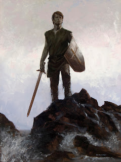
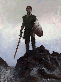
Results.
 |
| The final image taken with the Canon Powershot S90 |
 |
| Click for an actual pixel detail of the S90 shot image (no up-scaling in
Lightroom). I would be perfectly comfortable delivering this to a
client. |
 |
| The final image as shot with the 5d Mk2. Cleaner color, higher native
resolution (about double), and slightly more subtleties in tonal range,
though still the results are near identical when reduced and converted
to web images. |
 |
| Click for an actual pixel detail of the 5D Mk2 shot image (no up-scaling in
Lightroom). |


