Monday, December 26, 2011

Goodbye 2011... (new gallery pieces)


"Wonderland", 16x20, oil on panel

In a couple weeks, I'll be showing some new personal work at Artists House Gallery in Philadelphia alongside my brother Anthony. Details here, come check it out!


"Entropy", 30x40, oil on panel


"This Day, Gone Forever", 16x20, oil on panel


"Boris", 16x20, oil on panel


"Wallflower", 16x20, oil on panel


"Atrophy", 30x40, oil on panel

Friday, December 16, 2011

new work

I've been cranking like crazy over here on some new gallery pieces and a number of commissions. These two are ones which I'm able to show, hooray! The gallery work will likely be up in the next week or two. Until then...


12x12, oil on illustration board


18x27, oil on illustration board

Friday, November 18, 2011

So you plan to commission a book cover?

I've been getting more than the usual number of emails lately from self publishing authors looking to hire an artist for their project. Unfortunately, the commissioning process has largely been opaque over the years with many buffers between author and artist and this can lead to some awkward attempts, ruffled feathers, general frustration, and poor results for indie first-timers. I recently gave a lengthy explanation of the commission process to an author in a series of emails and decided that it would probably be a good thing to rewrite this into a big ol’ blog post and share that info publicly.

First things first, the question I heard most often at World Con earlier this year was not “what is the commission process?”, but rather “how do I find an artist?” There are a few very good resources for doing this. The first and most obvious is to just browse the local book store and look for the artist credits listed on the book jackets. Most any working illustrator’s email is a very quick google search away, so once you’ve identified someone who’s work feels like a good match to your own, getting in touch with that person should not be difficult. Another resource is the Spectrum Annual, which is put out every year showcasing some of the best of the field of SF/F artwork and can be found at most any bookstore and easily ordered online. Another avenue is to go to SF/F conventions and do some face to face networking. Finally, there are many online art communities and galleries which provide access to literally tens of thousands of artists around the world. Some to check out would be CGhub.com, deviantart.com, and theartorder.com

Once you’ve found your artist(s), your next step is to make contact. Here is where the process begins. First, the particulars of the contract are agreed on, those being: the budget, the rights being purchased, and the due date for the final art. Contracts can cover other issues as well, but those three are the root of it. For cover commissions, there are standard practices which can at least serve as a starting point (if you're thinking to yourself that you wouldn't know where to begin). There is almost always flexibility for negotiation, these are just industry standards:

-Standard cover rates with a major publisher average at $3000, and this can be higher and lower depending on a number of factors (size of the company, wrap around images, time frame, etc.). Mid level publishers generally pay more in the $1200-$2500 range. Small press is likely under $1000. Keep in mind what clients the artist is regularly working with when planning your budget. Time spent on your project is time away from another, so it would be difficult for an artist to justify cutting their rate dramatically.

-The rights purchased are typically First Reproduction Rights (either North American or Worldwide) which means that the publisher has the first printing rights to the image (as oppose to if the image had been already used on, or was simultaneously being used on, another product). This is a limited usage (the publisher does not own the copyright, they are leasing printing rights) and the artist retains long term rights of the work as well as the original painting. Many times, second usage rights may be available on an existing image and may be easier to secure for a lean budget. If you know of a particular piece which the artist has done that might work well for you, ask if 2nd use cover rights are available. Personally speaking, I feel it’s best to avoid work which has appeared on a book cover previously, but there are many other places to look. Of course, this is easiest with more general subject matter like a spaceship or landscape.

-The due date is probably the most varied of these issues. It generally just depends on the specific needs of the publisher and how well the artist can accommodate those needs. Common turn around tends to be about 2-3 months, though sometimes an artist can take very short deadlines and other artists are consistently booked four months ahead and need at least as much time to add a new project to their schedule.

Once the specifics of the job have been determined, the artist will prepare rough sketches for the client. These are sometimes made from a specific concept which the client has already selected, or from the artist reading the manuscript and presenting their own concepts. In either case (or situations which are something in between), I personally feel that the most successful covers often come from an art director choosing the artist who naturally fits to the subject and tone of the story and then allowing the artist to find their own solutions without micromanaging. I'm not sure how that sounds coming from an artist, but the principle is the same of any professional you might hire: This person is presumably an expert and you get the most value by presenting them your problem and letting them present solutions. Good communication always leads to the best results.

Once a sketch has been agreed on, the artist then creates the final image to be delivered on or before the agreed on due date. Hopefully the image will satisfy both the artist and the client, though occasionally revisions will be needed. Small revisions are things like refining or correcting certain details which might not have been totally clear in the sketch, or making other adjustments which could not have been foreseen and wouldn't require a major repainting. Heavy revisions would be making changes which would require heavy reworking of the image and almost always are issues which should have been discussed at the sketch phase. Small revisions are typically done at no additional expense (except when more and more and more are requested, this is often stipulated in the contract), Heavy revisions usually come with an additional fee which is negotiated at that time. Heavy revisions are pretty rare in publishing, that tends to happen more in advertising and other industries where concepts can change dramatically after the sketch had been approved. There’s really no excuse for it in cover illustration unless somebody failed to do their part correctly.

Once the final artwork is approved, the client pays the artist whatever amount is due (some contracts have half paid up front and half on completion, some have the full balance due on completion) and the artist delivers the image, which these days is typically done in the form of a high resolution digital file by FTP or some other file delivery system (dropbox, yousendit, etc.)

At this stage, the cover will still need design. This is not handled by the artist unless it was specifically agreed to in the contract (which is highly uncommon). Most publishers have inhouse designers, though some work with freelance designers. For self publishing, I'd urge anyone who does not have a design background to seek a professional designer because even the best cover image will fall flat if the design is sub-par. I’ve seen this happen and it’s not pretty. Nothing makes a book look cheap like bad design. Much like illustration, graphic design has its own resources and online communities.

A few final thoughts that I want to end with:

-You get what you pay for. Budgets are probably the most difficult issue for self publishing and it’s not easy, but keep this in mind. And plan to leave budget for a designer.

-Communication is critical. Honesty, politeness, and professionalism should be expected from both sides. Poor communication is at the root of almost all unsatisfactory commissions.

-We’re all on the same side. I’m amazed how much passive aggressive animosity I’ve seen online and overheard at conventions between authors and artists. Just keep in mind that everyone wants the cover to look good, the book to do well, and all parties to walk away happy. I promise you this.


David Palumbo is a second generation professional illustrator and current art director for Night Shade Books.

Thursday, September 22, 2011

Coral demon

This is an experiment I started a couple months ago and finally found the time to wrap up. I'm playing with improvisational design here, starting with a very loose plan and then rendering little by little to a finish. Working with a deer skull on one side and a photo of a jelly fish on the other as reference (and the girl, obviously). It's really fun getting lost in there.


12x15, oil on illustration board

Monday, September 19, 2011

Innistrad

Here are some images from the newest Magic release:


14x19, oil on illustration board


11x15, oil on illustration board


11x15, oil on illustration board


11x15, oil on illustration board

Wednesday, September 14, 2011

pencils

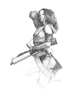
For the past few years, I've used my sketchbooks almost exclusively for working out roughs, thumbnails, and generally sloppy idea development and occasional life studies. I've never been the sort of person who's sketchbook was full of rendered, beautiful drawings. Getting to painting was always more exciting. The specific drawing time I've set aside has mostly been quick figure studies and pen practice. As a result, its been a long time since I did any drawing just for the sake of making a "finished" drawing. Well, with the time spent sitting behind convention tables in the past month or so where I had no paints available, I found the opportunity to do some pencil rendering and I had forgot how much fun it is! A great medium, this pencil and paper...


pencil on bristol, 11x14

Wednesday, August 24, 2011

Through a Blood Red Veil


oil on illustration board, 16x27

Here's a new piece completed for a private commission. At the request of the client, I was documenting the painting as it came along, so I figured I'd attach my process shots as well.

Step 1: thumbnails

Here are a few rough thumbs from the very early stages of the painting. At this point, I've discussed the general concept with the client (a harem girl dancing for a sultan, either in a palace or tent) and begin by playing with shape based compositions, more abstract than representational. The girl dancing is pretty much the only element that I know exactly what it is, the other shapes will evolve into figures and objects.

Step 2: rough sketch

Once I've done a number of thumbs, I'll either scan or re-draw the composition into photoshop and begin planning in value. In this case, my initial sketch was very loose just to check if the client is satisfied with the direction so far

Step 3: the drawing

Next I prepared a more resolved drawing which shows more clearly the details of the image. Perspective is still freehand and loose. I've also shot reference images for the figures. Sometimes I do this sooner, sometimes later, but I always reference my figures and any other subjects I feel necessary.


The client wasn't entirely happy with the pose of the girl and so I sent a revised version. I'm glad they requested the change, because the second go worked so much better!

Step 4: studies


These color studies were done to help plan the palette and value structure. Neither really satisfied me for a complete plan, but they helped prepare me for important decisions which would be made later on. These are oil on illustration board, about 5x8.5 inches each


This is a digitally reworked scan of color study #1 converted to B&W. At this point, I wanted a clear value plan to proceed with my underpainting.

Step 5: the transfer

Now that I have an approved drawing, reference, and a value plan, I begin to prepare the final painting. My illustration board has been cut to the correct size and prepped with three thin coats of acylic gesso. On a sheet of tracing paper/velum, I lightbox a transfer image in pencil from my sketches, drawings, and photo refs. This is done in reverse so that I can lay it on the board and rub the graphite onto the gessoed surface. I'm concerned with contours and shapes and only indicate tone as linear shapes of light and dark. I also make sure that my perspective is all correct and all details are as I want to paint them. This is the structure on which the painting will sit, so I prefer to get it right and not have to make changes down the road.

Step 6: the underpainting

Now I do a general value study in acrylic. This is just another step in the series of bringing the image into focus and the acrylic will seal down the graphite.

Step 7: executing the image in oil


Monday, August 15, 2011

Reno Worldcon 2011 Schedule

For those attending Worldcon in Reno this week, here's my scheduled events:

Wed 16:00 - 17:00, Getting Started in Illustration (Panel), A01+6
(RSCC)
Established artists answer questions about the business
side of being an artist: Promoting yourself, building your
portfolio, networking; what are the important steps to get
your foot in the door as an illustrator, and then succeed?
-David Palumbo, Anthony Palumbo, Bob Eggleton, Richard Hescox, John Picacio

Thu 11:00 - 12:00, Collaboration in Game Design: Designers and
Artists (Panel), A01+6 (RSCC)
How does the art influence the design of RPGs and video
games?
-Howard Tayler, Jon Schindehette, David Palumbo, Tom Lehmann, Dave Howell, Tanglwyst de Holloway

Thu 14:00 - 15:00, Vallejo Does Tarot (Panel), A02 (RSCC)
Boris Vallejo and his family have been illustrating their
own marvelous version of a Tarot card deck. Come see for
yourself and hear about this collaborative project.
-Boris Vallejo, Julie Bell, Anthony Palumbo, David Palumbo

Thu 19:00 - 20:30, Meet the Artists (Event), Hall 2 Art Show (RSCC)
Here's a chance to talk to the showing artists about their
own work, in the Art Show! All the attending artists who
can make it will be by their displays.

Fri 11:00 - 13:00, Art Portfolio Reviews (Workshop), A18 (RSCC)
Art GoH and Art Directors review portfolios of aspiring
Artists. Advance Registration Required - email
art@renovationsf.org
-Jon Schindehette, Lou Anders, Boris Vallejo, David Palumbo, Irene Gallo, Liz Argall

Sat 11:00 - 12:00, Building Your Art Portfolio (Panel), A16 (RSCC)
Whip together all of your art pieces and voila! You have
your art potfolio all ready to go! It's that simple, right?
-Jon Schindehette, David Palumbo, Liz Argall, Lee Moyer, Karen Haber

Sat 11:00 - 12:00, Meet the Artists (Event), Hall 2 Art Show (RSCC)
Here's a chance to talk to the showing artists about their
own work, in the Art Show! All the attending artists who
can make it will be by their displays.

Sat 12:00 - 13:00, Painting for Collectible Card Games (Panel), D03
(RSCC)
A lot of amazing artwork goes onto collectible game cards.
What's it like painting for that market? How is it
different from other projects?
-Martina Pilcerova, Jon Schindehette, Kaja Foglio ,David Palumbo


Sat 15:00 - 16:00, Autographing: Sat 15:00 (Autographing), Hall 2
Autographs (RSCC)
-Julie Bell, Boris Vallejo, Anthony Palumbo, David Palumbo, Winona Nelson

Sun 12:00 - 13:00, Marketing Yourself on the Web (Panel), A05
(RSCC)
Does web site design still matter in the age of social
media? How should a nontechnical artist or author approach
the question of how to market yourself electronically?
-Lee Moyer, Jon Schindehette, David Palumbo, Mignon Fogarty, Tara O'Shea

Sun 14:00 - 15:00, Book Cover Design: Using Cover Elements to their
Best Advantage (Panel), A04 (RSCC)
There's more to a cover than the artwork: fonts, blurbs,
title and name placement all have a huge impact on the
final effect. How to design book covers that make the best
of their art, author, and other material.
-Lou Anders, David Palumbo, Irene Gallo


See you there!

Monday, August 1, 2011

The Lone Ranger and Tonto

This was a cover illustration that I did some months back and never posted. I brought the original out to San Diego and it got a HUGE response. I didn't even know about the upcoming movie until a week or so ago. Yes, yes, prints will be available soon ;)

edit: prints now available: http://dvpalumbo.com/store/prints.html


oil on illustration board, 14x21

Friday, July 15, 2011

Convention season is here!

Hey all, just a quick mention of the shows I'll be attending these next few months!


San Diego Comic Con (July 20-24)


I'll be showing once again in San Diego with Daren Bader at 4914, next door to the mind blowing Allen Williams. Anyone attending should stop in and say hello, we'll be there all weekend with originals, books, DVDs and prints. Now that my prep is finished and the materials are enroute, I can say without hesitation that I'm really looking forward to a weekend of seeing old friends, buying amazing new art books, and soaking up some concentrated inspiration :D

Worldcon (Reno NV, Aug 17-21)

Boris is this year's Artist Guest of Honor at Worldcon, so the whole family is heading out. I'm already scheduled for a whole slate of programs about art and the illustration business, along with portfolio reviews along side Boris, Lou Anders (Pyr Books), John Schindehette (Wizards of the Coast), and others. Actually, there's a ton of cool art programming going on, check out John Picacio's blog for more info.

Dragon Con (Atlanta GA, Sept 2-5)

It was my pleasure this year to participate as one of the art show jurors, so I'll be out as a guest taking part in the art show events as well as some other programing. I know for sure I'll be doing a presentation on promotion and job hunting for freelancers as well as a big group panel about the Tarot set that we have coming out next year. I've never been to a Dragon Con but *everyone* has been telling me I need to go and I'm very excited to finally check it out.

Illuxcon (Altoona PA, Nov 3-6)

Wrapping up 2011 close to home at my favorite of all conventions: Illuxcon. A quiet, pleasant weekend of art overstimulation and inspiration with some of the most amazing people you'll ever meet. How can it get better than that?

Tuesday, July 12, 2011

Zombie prom date

That's not really the title for this book, but that was the only thing I could think of as I was painting it. For a collection of zombie YA stories. In preparing for this, I learned about the massive popularity of Bieber hair with boys in middle and high school


oil on illustration board

Wednesday, July 6, 2011

Another from the vault

Here's another old piece that's been under wraps. This was commissioned for Warhammer 40k about 2 years ago (or more?) and never saw print


oil on illustration board

Tuesday, July 5, 2011

Hope Summers

So I've been moving all the past week into a new house which also means a sweet new studio. Right now it's a pile of boxes, but in time... more on that later though. The reason I'm posting is because, in the process of sorting and properly storing some old paintings, I came across this little piece. Though I can't remember exactly when it was done, I want to say about a year or so ago. It wasn't for any specific project, just that I had some me time and felt like doing some simple X-Men portraits and decided to kick it off with a relatively newer character: Hope Summers. I seem to remember having started a Wolverine as a follow-up before a wave of new deadlines and convention season hit me with the one-two and, in the end, this was the only one I actually finished. Why I didn't show it at the time I don't really know other that I probably meant to and just forgot. Which reminds me, I have some other pieces waiting to go online. Maybe once I get my SDCC prep finished.

Anyhow, it's pretty simple and straight forward, but I like it. Maybe once things calm down a bit I can get back into these. I've always wanted to do a proper Nightcrawler...


11x17, oil on illustration board

Thursday, June 2, 2011

dancing girl prelim sketch

I don't post WIP and sketches when working with commercial clients (which is to say I rarely post them at all), but here's a sketch from a private commission that I'm starting on. I think it'll be fun getting into the paint :)

Monday, May 30, 2011

Priestess of Torment

This is for a group show at the OhNo!Doom gallery in Chicago that opens next weekend. I think I'll let it speak for itself


15x21, oil on illustration board

Monday, May 16, 2011

Microvisions

Though the piece was completed in April and the show hanging at the Society of Illustrators a few weeks now, I was waiting until the auctions went live to share my contribution to the Microvisions scholarship. If you're not familiar with the event, each year a dozen or so sf/f illustrators are invited to create a piece measuring 5x7 inches which is then sold through a fundraising auction held by Society of Illustrators. The money raised goes to students selected through their annual jurried student competition. To check out the other pieces and maybe take one home, here are the Ebay links. Bidding closes on the 25th I believe.


oil on illustration board, 5x7 inches

Tuesday, April 26, 2011

Infidel

A recent cover, sequel to God's War. I started work on this right around when I got the news about Spectrum (see one post down), so there was a little extra incentive (which is to say, pressure) in not only advancing the cover narrative, but upping the ante visually. This is also very very slightly different from what the printed version will look like (a few additional details were revised, though I prefer this version). I only mention it because I'm uptight about things like that :P


18x27, oil on illustration board

Wednesday, March 16, 2011

Strength

Amazingly, the tarot series is nearly finished! I believe I only have three more to do before my 19 are all in, and we're expecting all 78 pieces to be done by the end of the summer. This is my most recent, catching up on more Major Arcana with Strength (which I was very surprised to see had not yet been claimed!)


14x21, oil on illustration board

***ALSO***

A few days ago I learned that I had received TWO medals in this year's (upcoming) Spectrum. I was awarded the Gold in the book category for Gods War and the Silver in the comic category for Sleep. Spectrum has come to be one of the two milestones of my creative year (the other being San Diego Comic Con) when I stop and assess where I've been and where I intend to go. It's a wonderful opportunity to reflect and a strong motivator to push further and explore, and I'm tremendously honored to have been selected for these awards. :D

Friday, February 25, 2011

The Whitefire Crossing

A recent cover piece here. This is the all oils version, though the printed cover will have some glowy red magic effects added where the figure touches to the tree. Story-wise, he's absorbing life from the living tree and the tree is blackening from his touch. This is how I picture it as described in the book, very subtle and quiet. For a cover to code as fantasy though, it was a bit too subtle. It was something we talked back and forth a bit, and in the end I think I prefer the original version as a painting though the more overtly magical certainly works better for the cover. Thanks to Photoshop, everybody wins :)


16x24, oil on illustration board

*edit* here's the digital retouch version as it was approved for print:

Monday, February 14, 2011

Though Smoke Shall Hide The Sun

A new piece for Tor.com, this time for a short from Brit Mandelo. This is a slightly different version of the piece from the one shown with the story. There was concern over the foreground character looking too much the victim (which I most definitely agree she should not) and so I was asked to give her a bit of a sly smile. It worked better for the story, though this version works a bit better for me, so here it is :)


9x16, oil on illustration board

Saturday, February 5, 2011

The Hanged Man

As we're closing in on the final stretch for the tarot series, I've found I have some Major Arcana yet to do. The Hanged Man is one that I'd called dibs on from way early on and then let simmer for, well, the past couple years I guess. I love the meaning and traditional interpretations, but I did want to move out of the box just a bit. The whole Tau Cross leg thing for example. It didn't feel necessary to the symbolism for me, and honestly I'm not even sure I understand it. So here's the outcome, a rare traditional/digital hybrid piece for me. Oh, and the model for the painting is my Dad, which was fun and strange, like making an alternate universe time traveling self portrait.


12x18, oil on illustration board/digital

Friday, January 7, 2011

Star Wars: Visions

In all the whirlwind of getting that last gallery show up, meeting deadlines, and the usual holiday madness, I totally snoozed on posting this piece! This was a painting for the Star Wars: Visions book which finally released in November. I'm not 100% on this, but I *think* I started this piece in early 2009 so it's been almost 2 years since I painted it. Though I would most likely think in a different direction were I to be offered this project again today, I'm still really pleased with how it came out.


13.5x18, oil on illustration board, 2009